[Design Story] SamsungOne, the New Universal Typeface for Samsung
Samsung’s activities cross different products, platforms, people, cultures and environments. SamsungOne is a unique font designed to help deliver a connected, universal experience for Samsung. It is a family of scripts covering 26 writing systems, more than 400 languages, and over 25,000 glyphs, creating a truly global typeface.
Users discover Samsung through products, the brand platform and culture surrounding the brand. At the center of this discovery is the SamsungOne Font, the building blocks of the universal Samsung experience. Receiving calls with your smartphone, watching your favorite shows on your TV, doing household chores with other appliances as well as the packaging and promotional campaigns seen in various media all converge on one Samsung voice. This signifies the singular and unified experience or world promised by Samsung Electronics.
The SamsungOne Font Connects:
People
Samsung speaks to billions of people around the world. SamsungOne is the core tool that helps us to create a universal Samsung experience.
Product & Platform & Service Experience
Samsung’s products range from mobile phone to TV, from laptop to microwave, and from oven to tablet. These communicate on multiple platforms including print, screen, form and environment. SamsungOne helps connect all of these as one experience.
Visual Language
SamsungOne sits at the heart of Samsung’s new visual language DNA, and provides a typographic foundation for the future.
The SamsungOne DNA Incorporates Specific Key Values:

Reliable & Accessible
Solid, reassuring and legible, with a consistent, friendly and warm visual tone.
Contemporary & Innovative
Modern, sophisticated typographic forms capture Samsung’s advanced design thinking.
Human & Enduring
Fluid and open, hand-made but structured, non-decorative and designed within a solid system.
Integrated & Expert
Built-in expertise and know-how ensures all products, experiences and people are connected.
SamsungOne is Designed Using Five Core Typographic Principles and Characteristics:

Humanist

SamsungOne mixes a simple, single-width stroke with more calligraphic details.
A squared curve is combined with angled terminal ends to create a font which is very human, flowing and open.
Distinctive
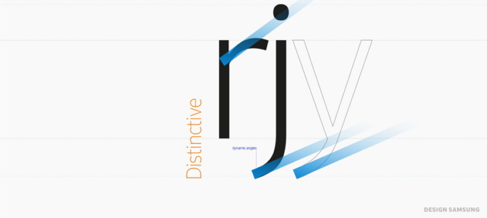
Dynamic angles that come from how an arc joins a line create a consistent design personality.

Prominent dots, distinctive diacritics and the tail on l add legibility as well we provide some of the distinctive design DNA for SamsungOne.
Universal
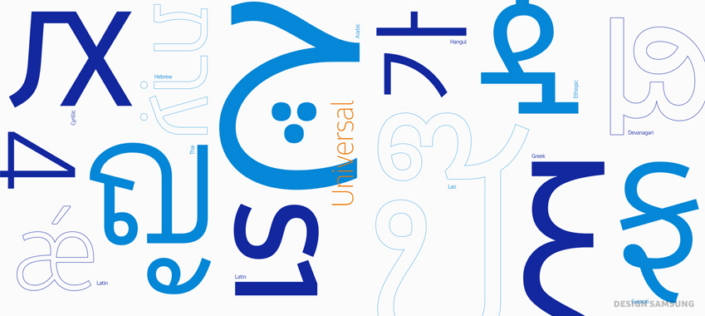
Like a global Family, SamsungOne is uniquely localized while speaking some of the same typeface DNA.
Expert

A crafted hands-on approach to type design and detail where small adjustments to height plus descenders and ascenders ensure balanced forms.

A balanced and proportional set of characters aids consistency.
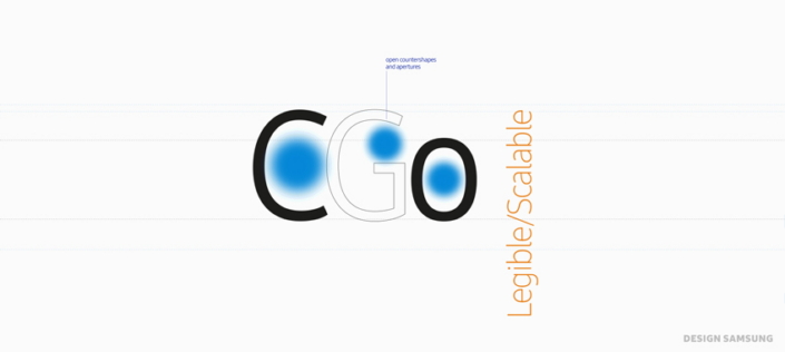
Legible/Scalable
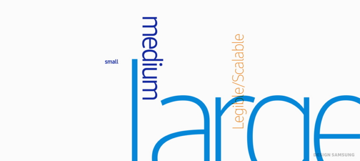
Letterforms are specifically designed to work functionally at small sizes, and dynamically at large sizes.
Characters are open and spacious aiding readability.
Specific details are added to ensure legibility at text sizes.

In order for information to be displayed efficiently on every platform, in every environment, Samsung have developed a large range of weights, and this range of weights enables expressive design and contrast for emphasis.
The untold story behind the SamsungOne Font, as well as an interview with world renown typographer Neville Brody, can be found in following video.
![[Design Story] SamsungOne, the New Universal Typeface for Samsung](https://i.ytimg.com/vi/3XlB-n2qLzk/default.jpg)


No comments: