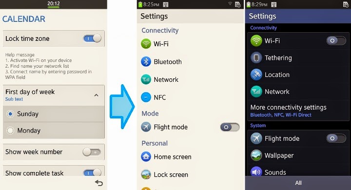
Some changes on Tizen UI and UX 2.2
As stated previously by Tizen Technical Steering Group (TSG), Tizen 2.2 brings several changes in the user interface (UI) and user experience (UX). Additionally Tizen 2.2 also brings the new hardware to replace the software.
1. UI layout change indicator for clock, battery, signal, connectivity and notifications
Tizen 2.1 on the previous version, the UI design for the indicator to clock, battery, signal, connectivity and notifications centered in the middle and then spread to the side if there is a new indicator is active. While on Tizen 2.2, the UI design of this indicator is now centered in addition to that later spread to the middle if there is a new indicator is active. Before the battery indicator thin elongated shaped hour indicators below, now left beside the battery icon shaped like in general.

2. Back and Menu buttons replace hardware buttons software
On Tizen 2.2, two new hardware buttons each Menu and Back buttons added to accompany the four hardware buttons that already exists, namely Home, Power, Volume + and Volume -.

Adding the new hardware is not only an impact on UI design, but also because of the loss of overall UX software Menu and Back buttons on Tizen 2.2 will change the user's navigation in each application.

Adding the new hardware is not only an impact on UI design, but also because of the loss of overall UX software Menu and Back buttons on Tizen 2.2 will change the user's navigation in each application.

3. Changes theme and icon design
Minor changes to the design theme and icons, for example, to a marker on / off, which is primarily used in settings to make it more easily visible. Black theme now looks better than ever.


No comments: